Botanical & Natural Forms
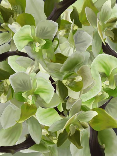
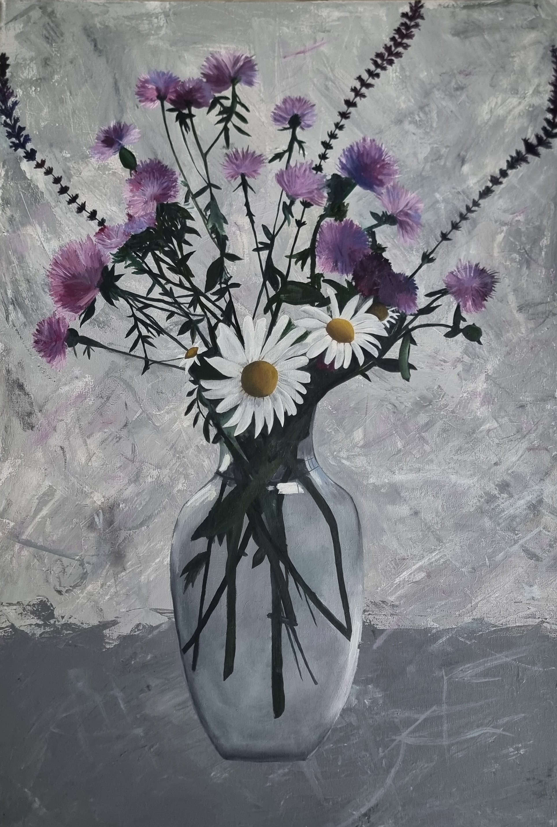
Exploring organic forms and natural textures through digital painting and traditional media. Working across multiple scales — from dense compositions to intimate close-up details — with a focus on colour accuracy, layering, and fine detail.
Reflection
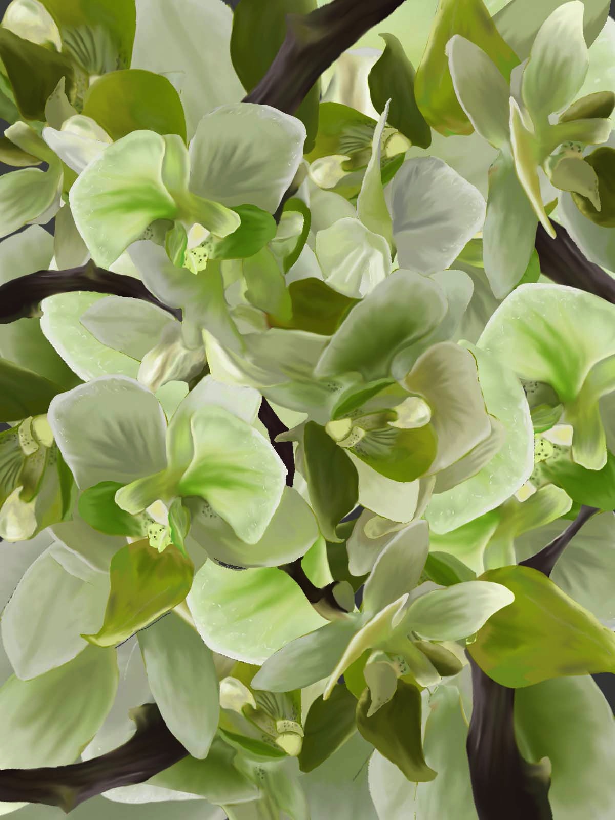
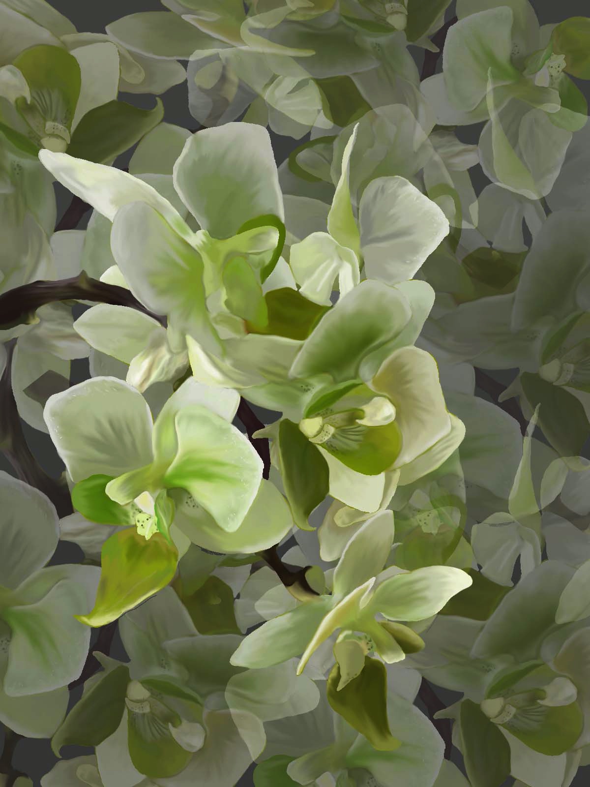
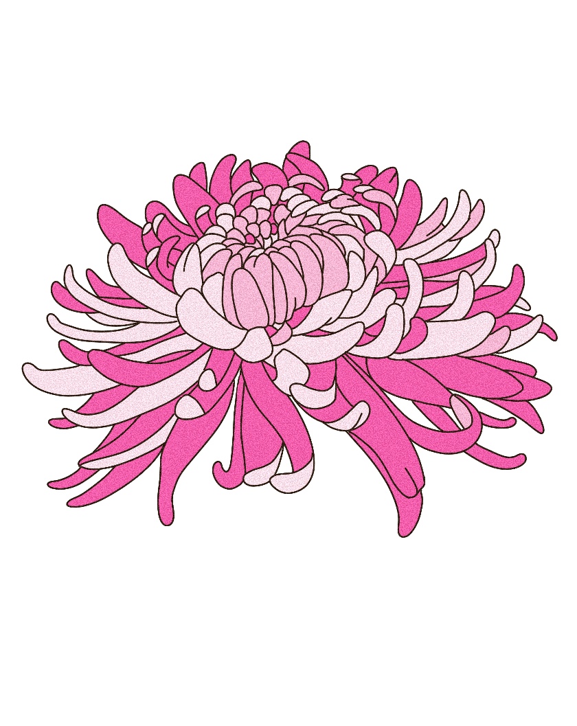
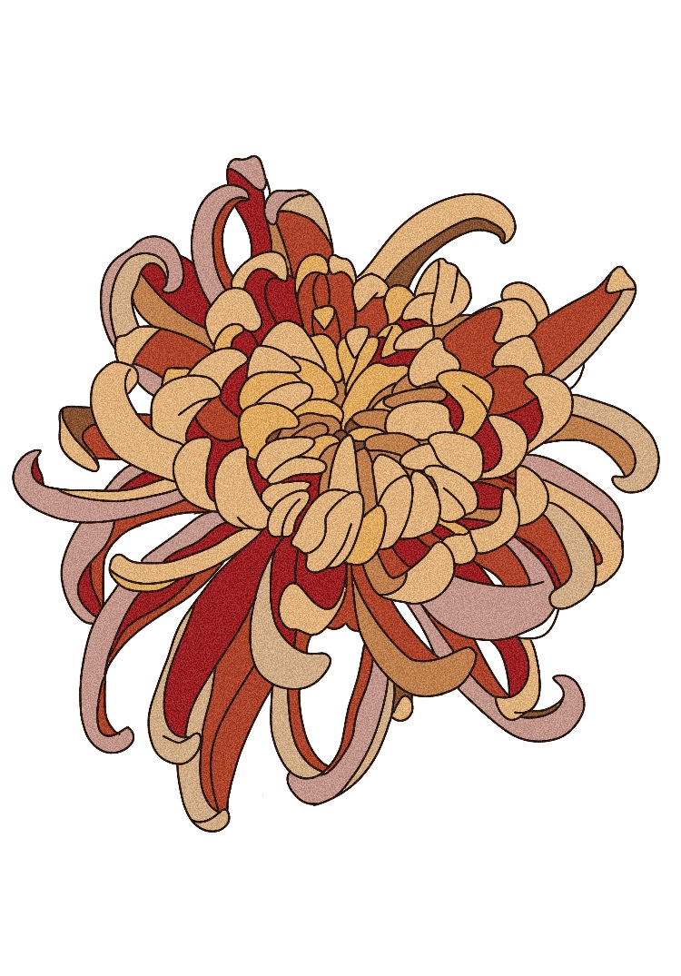
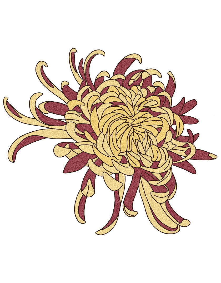
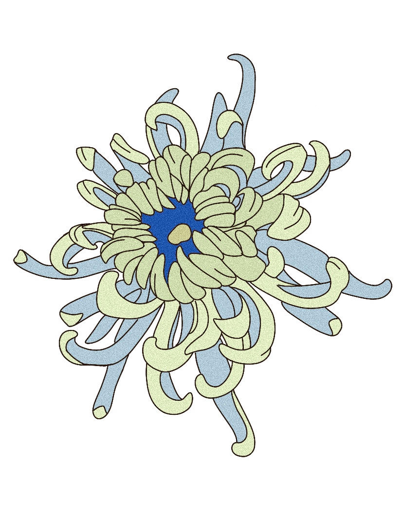
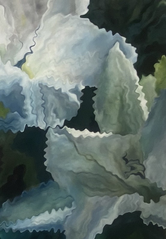
Through this series I developed stronger observational skills and a confident approach to colour mixing across both digital and traditional media. The orchid studies show my process — working from close observation to a faithful painted interpretation across different compositions. The new chrysanthemum series explores the same flower rendered in four distinct colour palettes, demonstrating control of digital illustration and a strong sense of decorative composition. These skills translate directly to print production, educational resources, and design work where image quality and accuracy matter.
Figure & Character Work
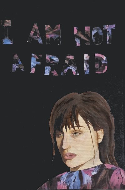
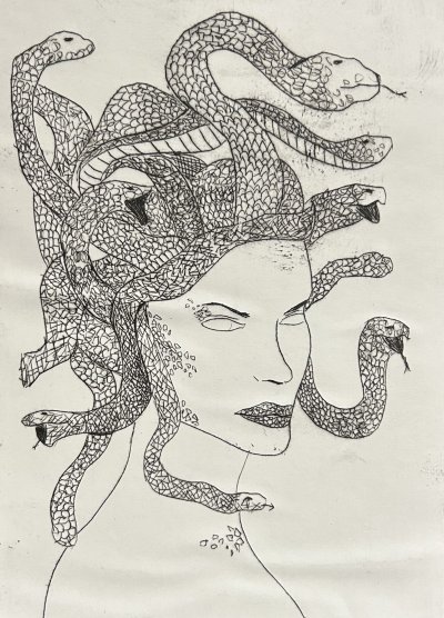
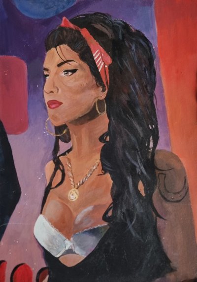
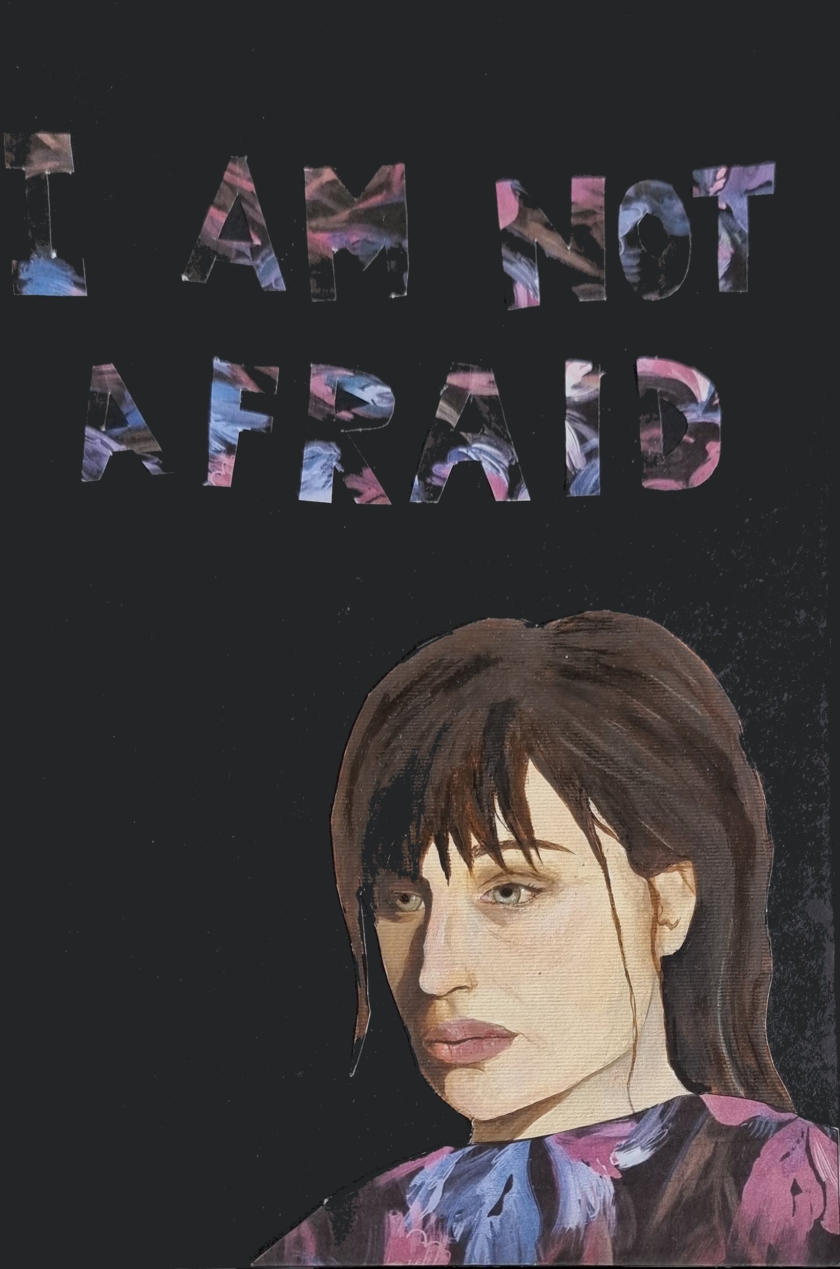
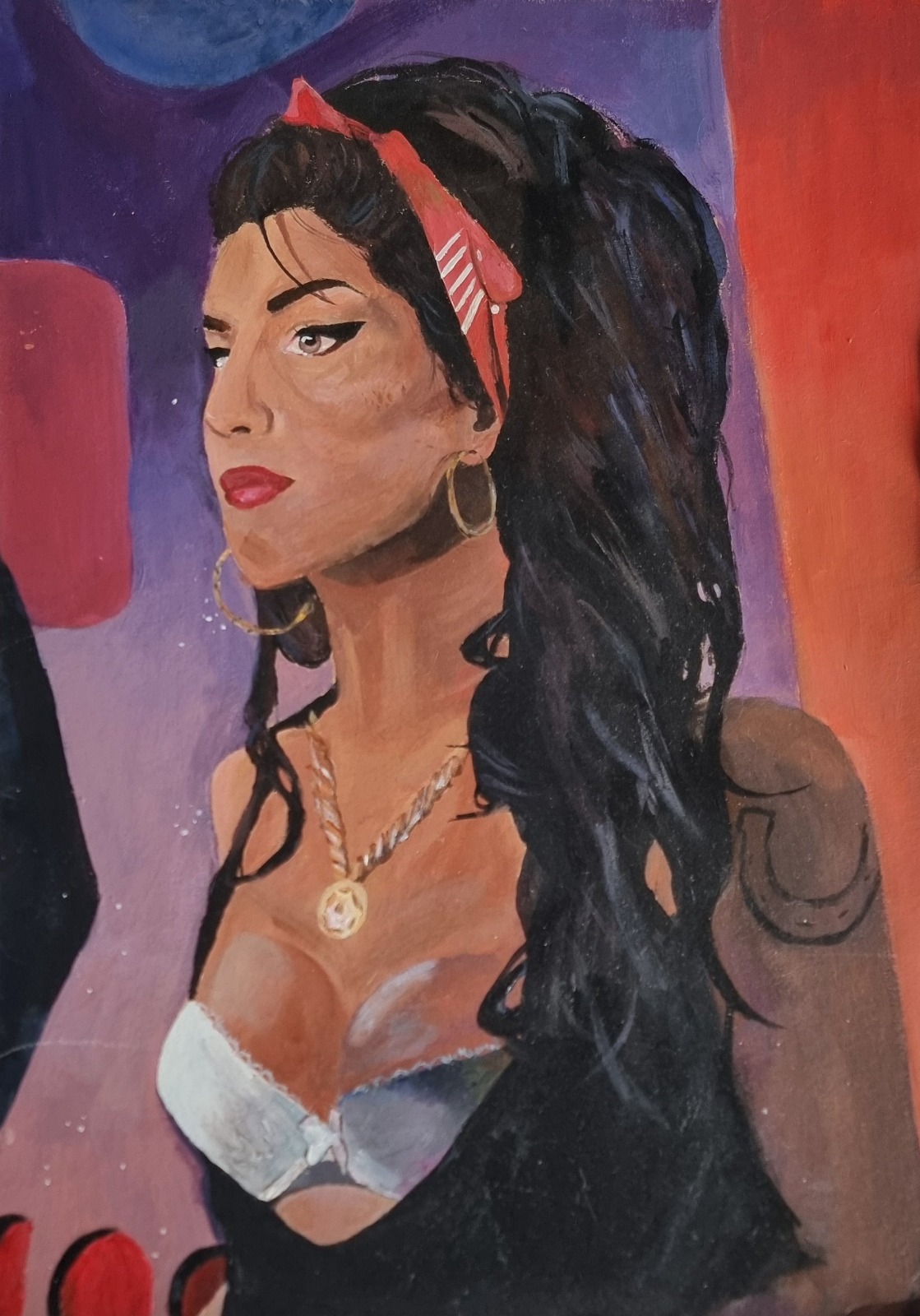
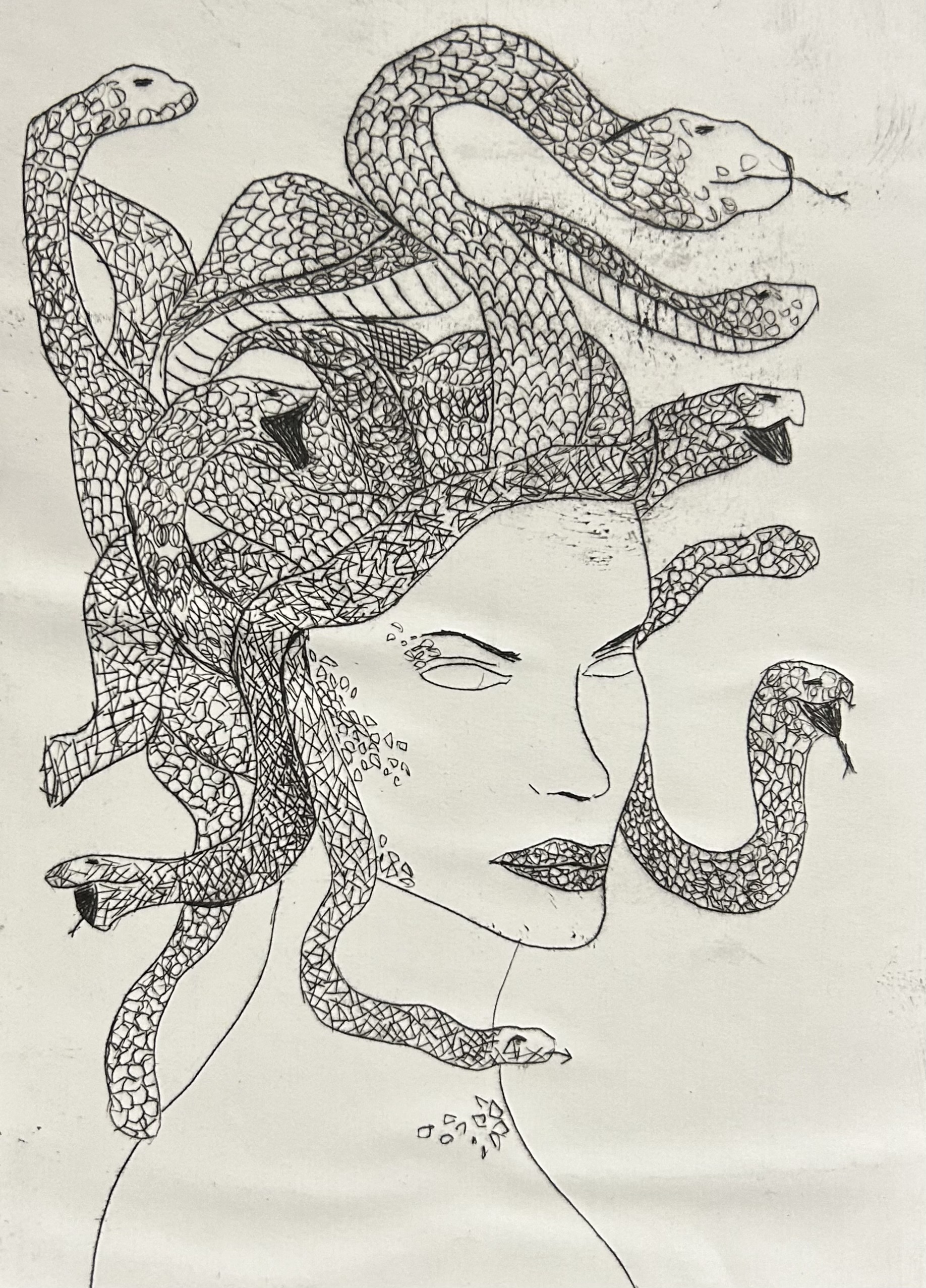
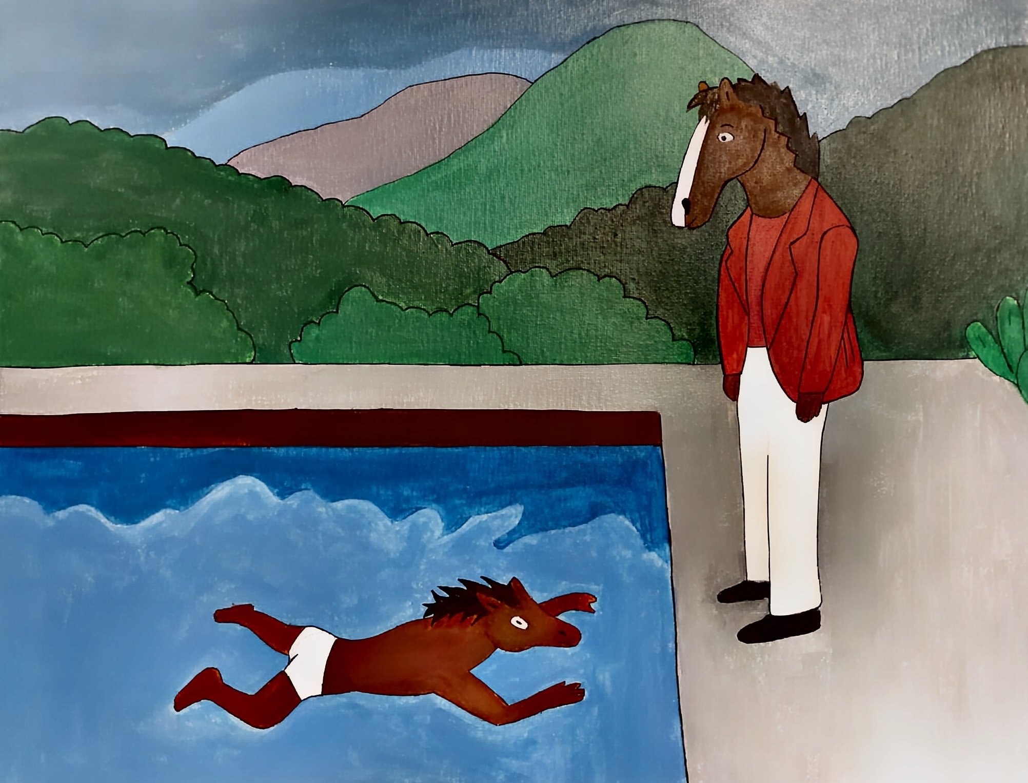
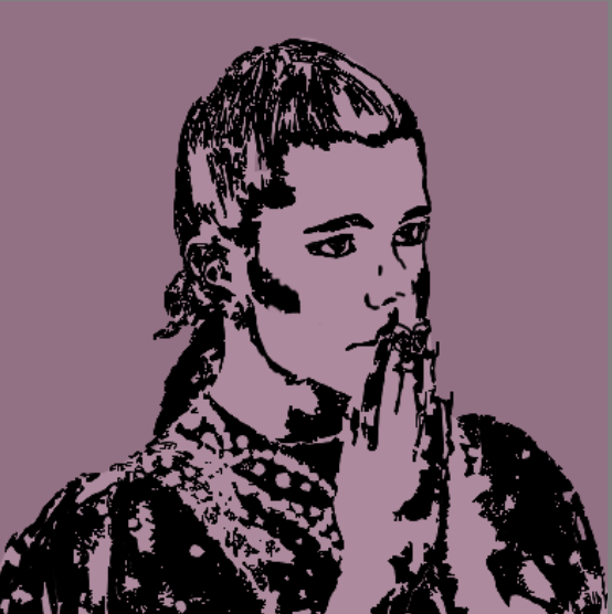
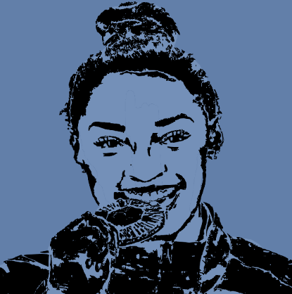
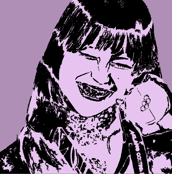
Exploring the human figure and character design across a range of media — from painted portraiture to pencil character sketches, digital illustration, and graphic print-style portraits. Each piece investigates expression, pose, and narrative.
Reflection
This body of work demonstrates range — from expressive painted portraiture to detailed ink illustration and pop culture reinterpretation. The Medusa drawing shows patience and intricate mark-making, while the BoJack/Hockney piece shows conceptual thinking and humour. The new graphic portrait prints add a further dimension: bold two-colour reduction, screen-print aesthetic, and confident simplification of a photographic source into flat graphic form. The variety of media shows adaptability — a strength for art technician roles where supporting diverse projects and students is essential.
Experimental & Mixed Media
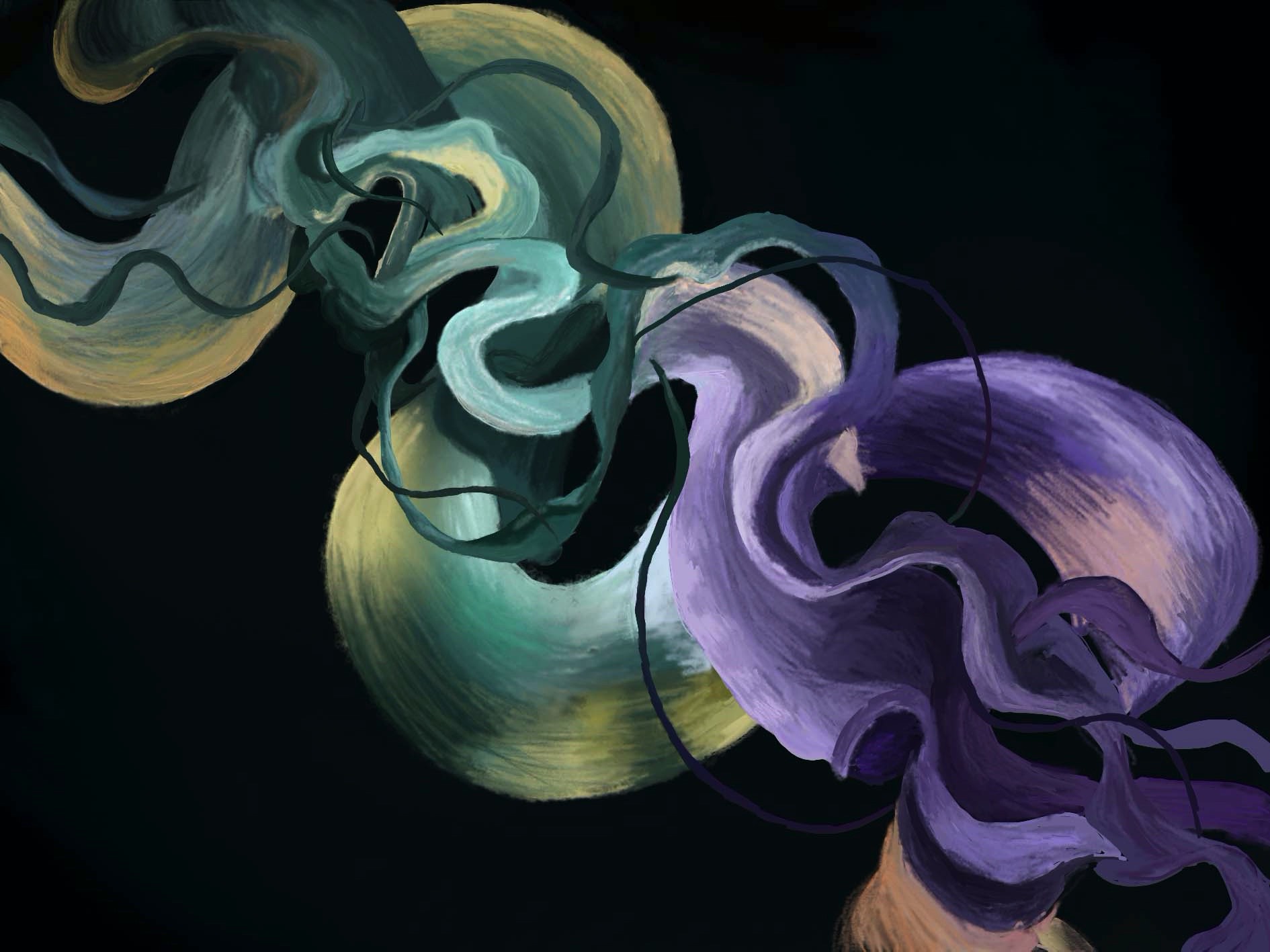
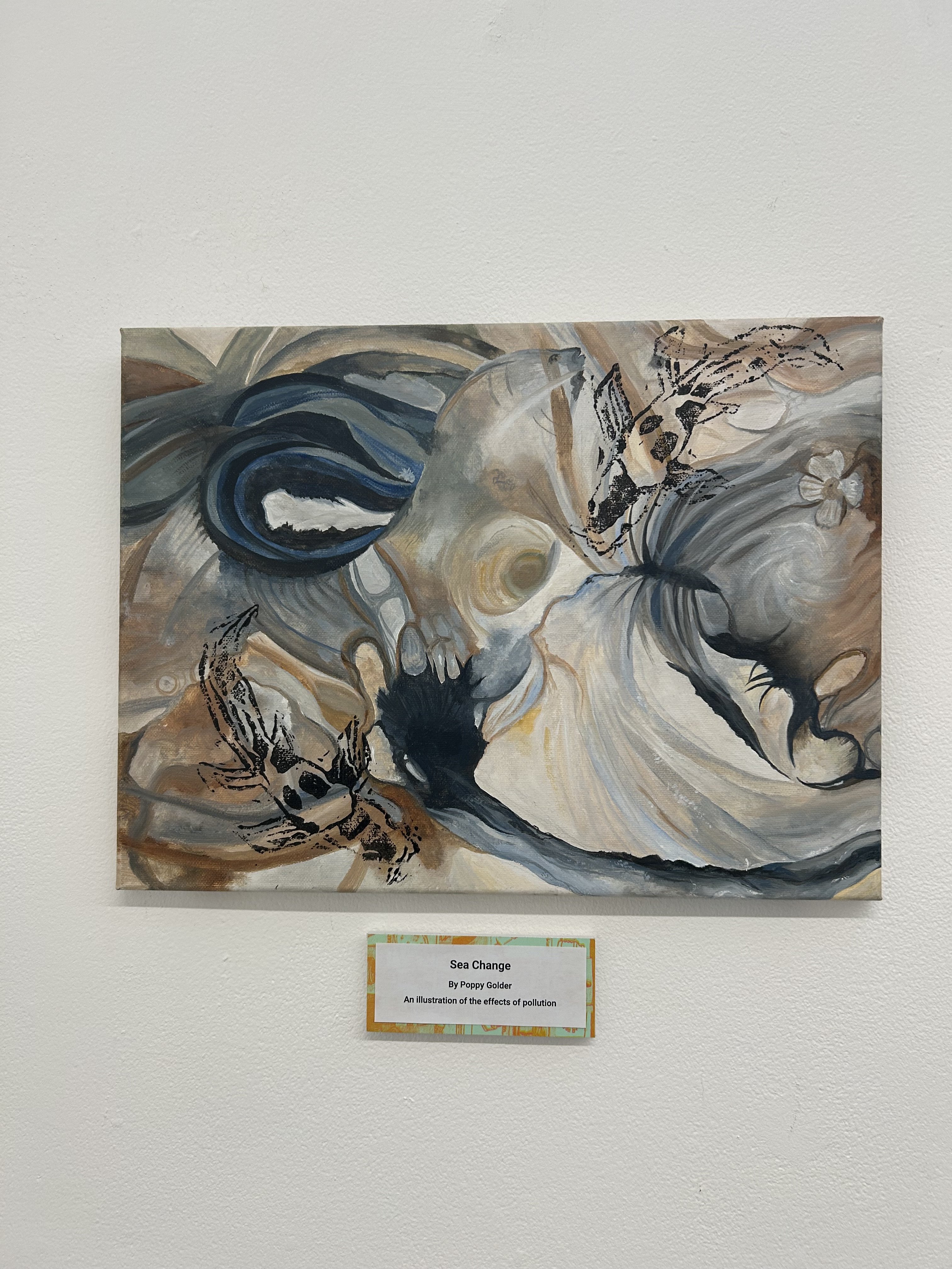
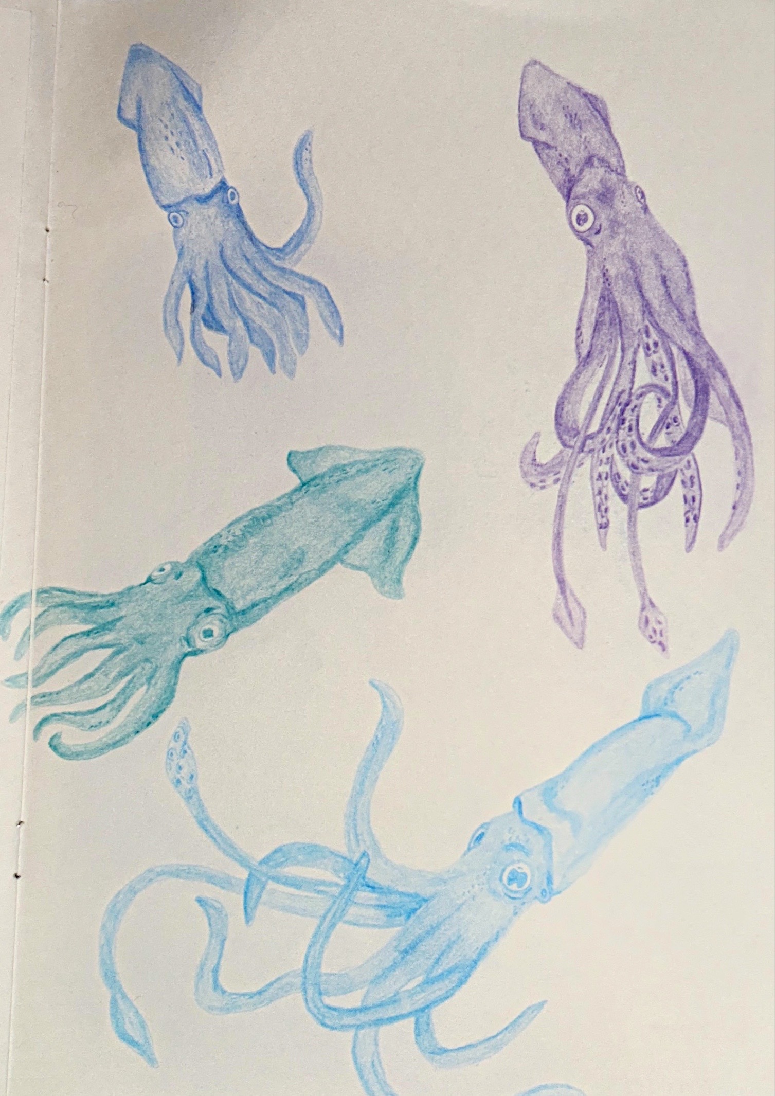
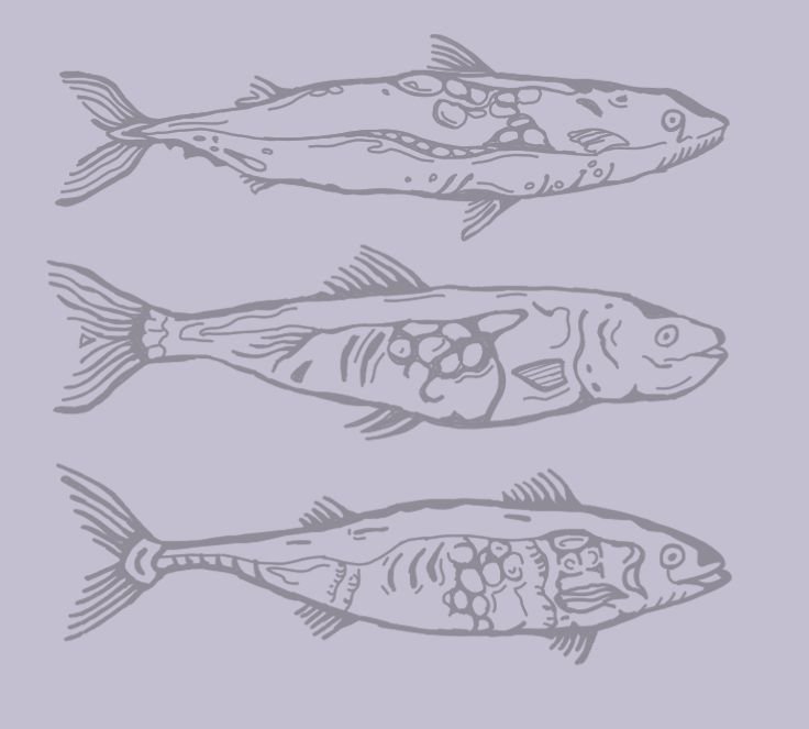
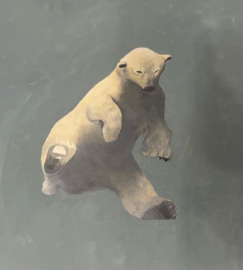
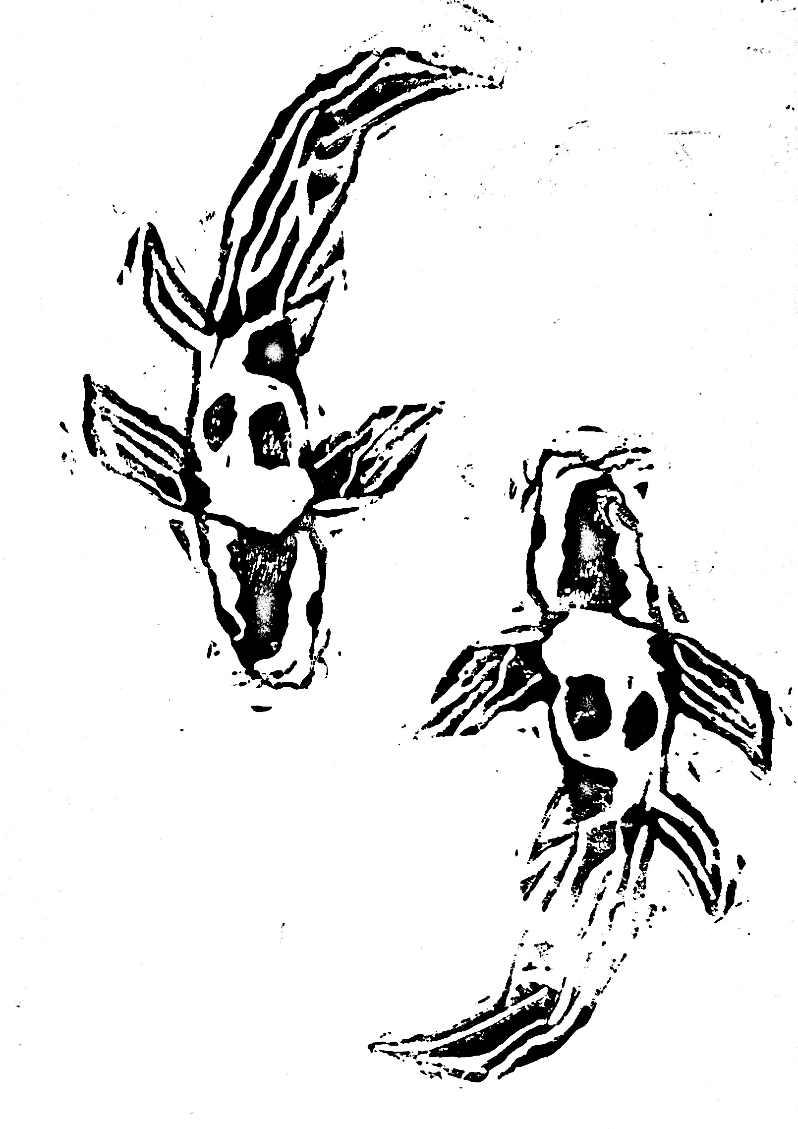
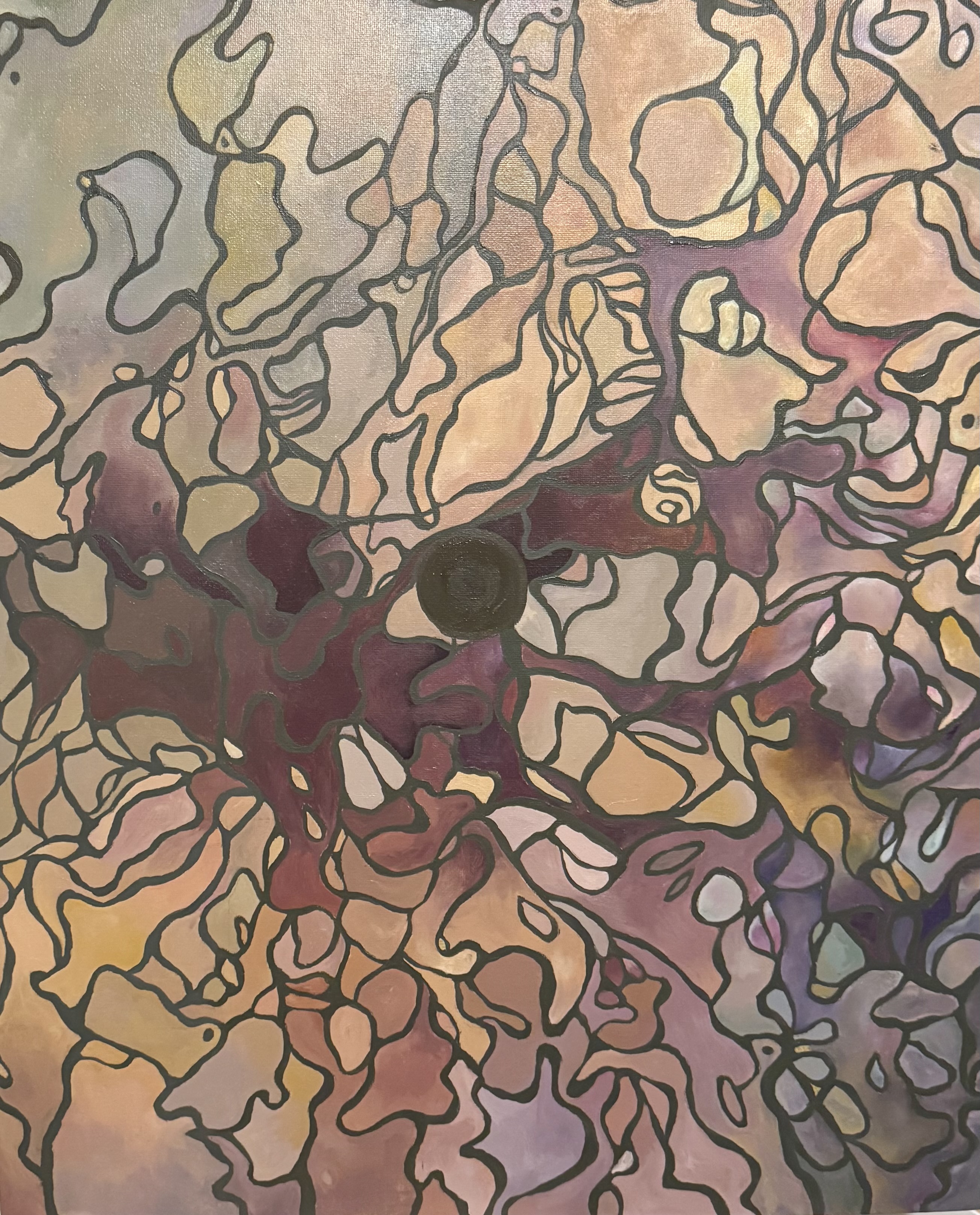
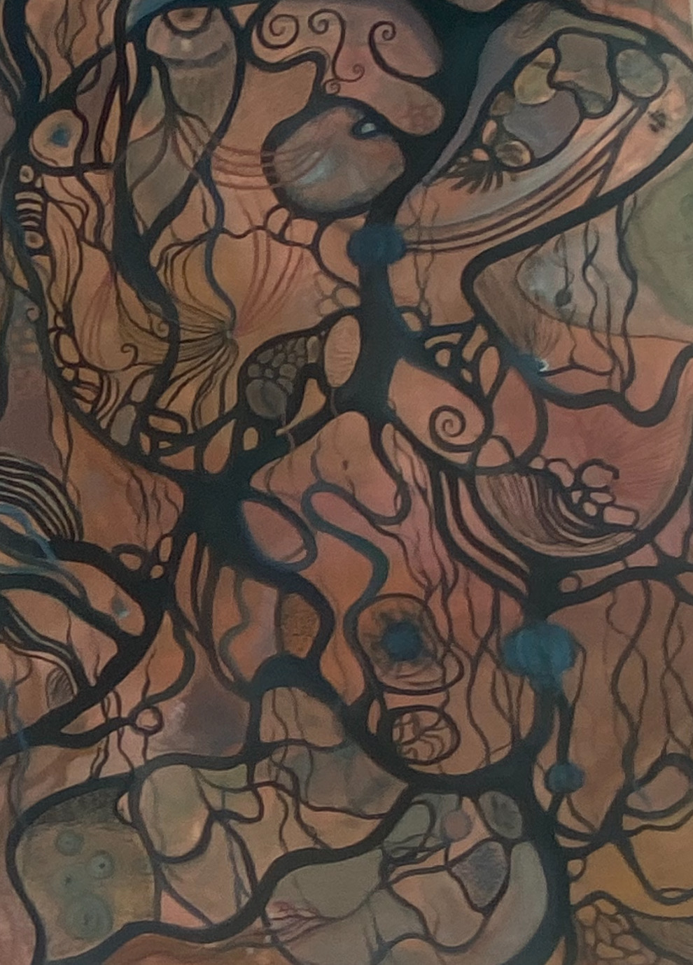
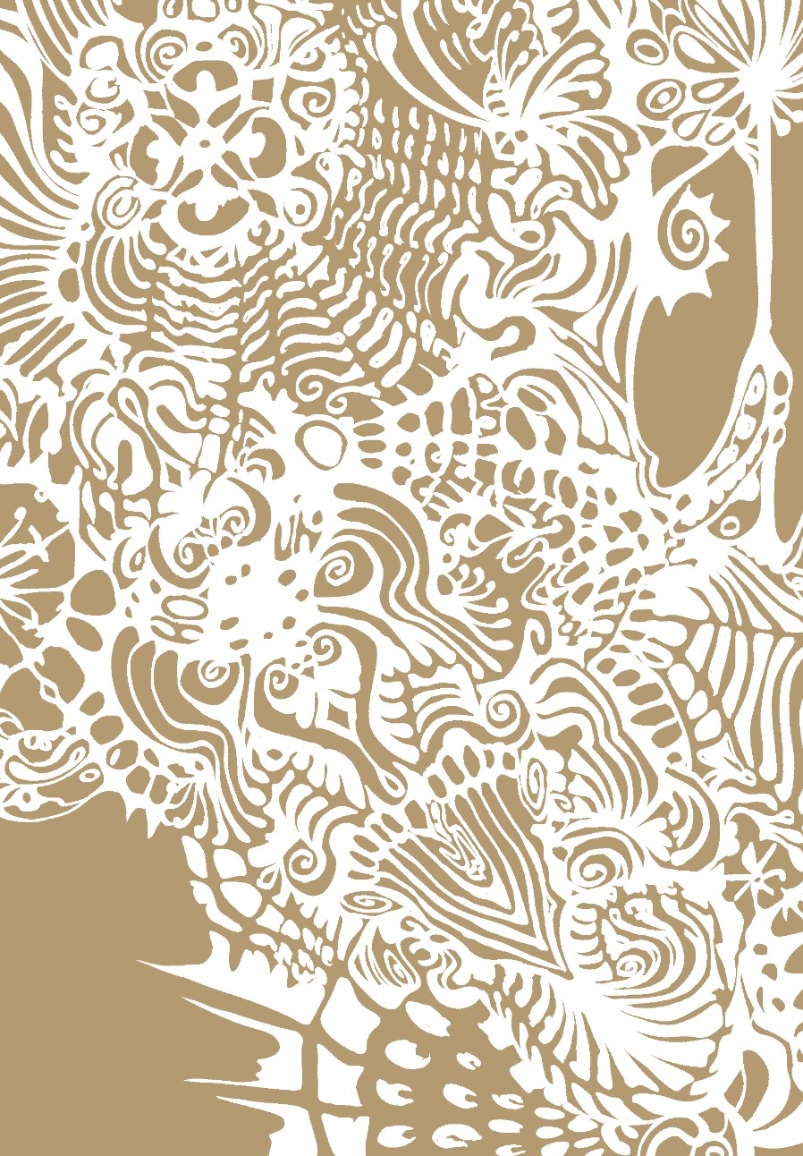
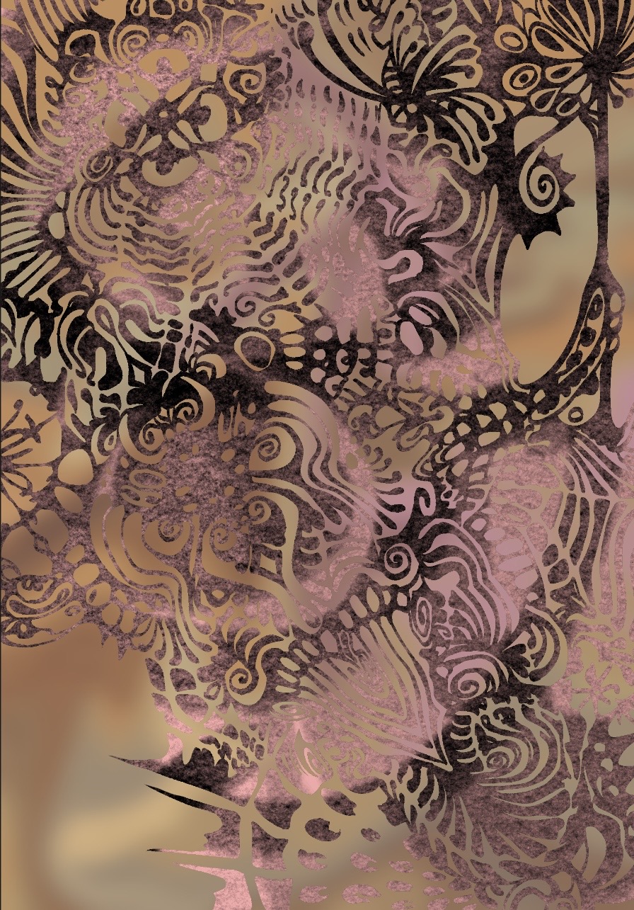
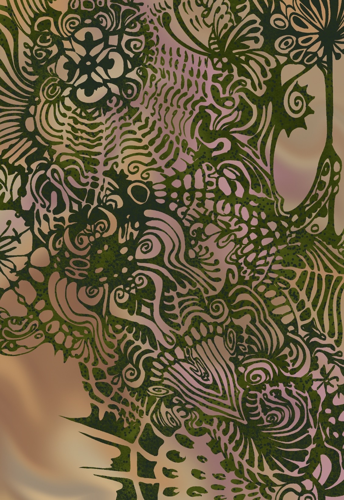
Pushing creative boundaries through abstract expression, large-scale installation, printmaking, and environmental themes. These pieces explore movement, texture, and form beyond literal representation — including a new series of abstract paintings and a developing body of print work.
Reflection
These pieces show creative confidence and a willingness to work across very different scales and approaches. The environmental thread running through "Sea Change", the squid and fish studies, the polar bear, and the koi lino print demonstrates conceptual thinking and the ability to sustain a theme across a body of work. The new abstract paintings continue this exploration of organic form, moving further into pure abstraction and texture. The print series — from the koi lino print to the intricately layered digital work — demonstrates technical range and an interest in process. For art technician and production roles, this flexibility — working across styles, scales, and materials — is exactly what's needed.
Graphic Design & Applied Work
Applying artistic skills to commercial and personal briefs — creating designs for real clients that balance visual impact with clear communication. These four projects demonstrate layout, typography, illustration for purpose, book design, and the ability to work sensitively across very different contexts.
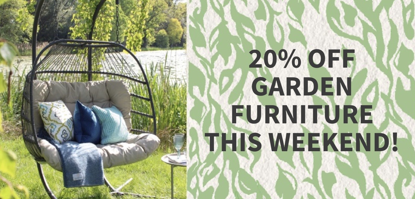
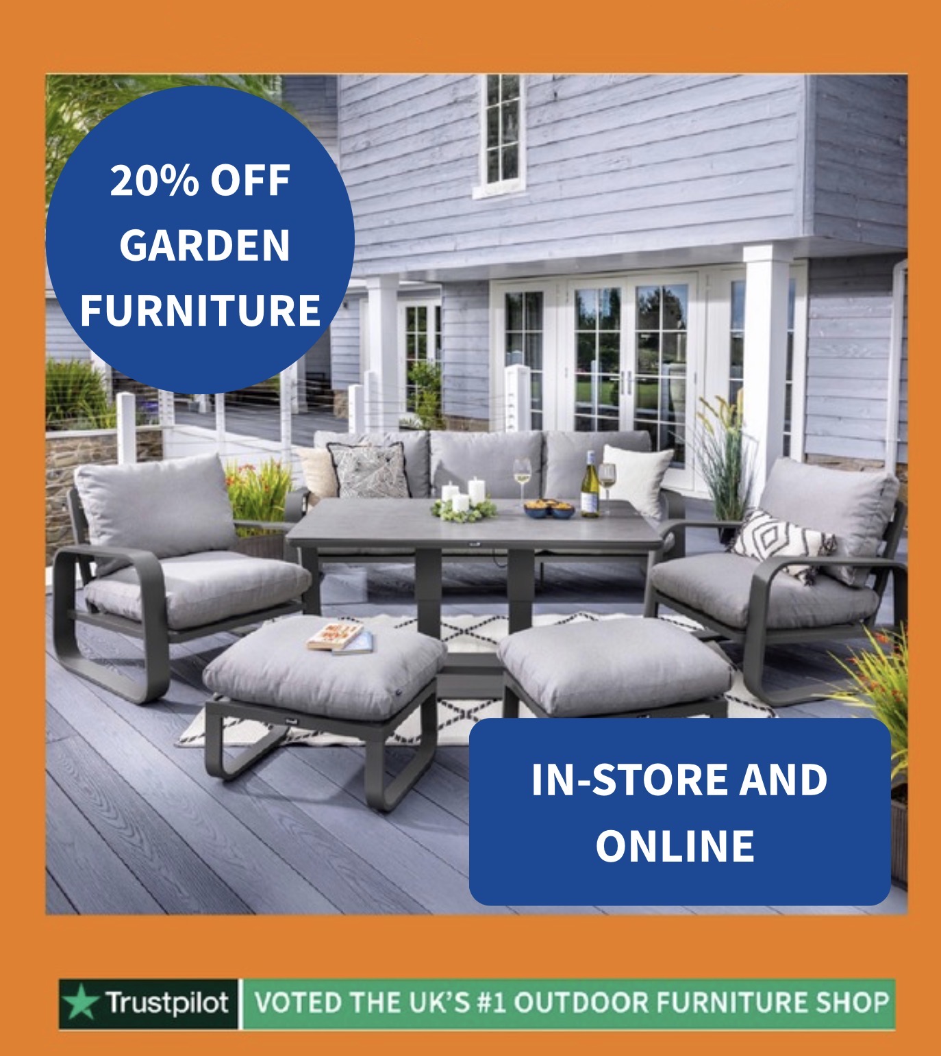
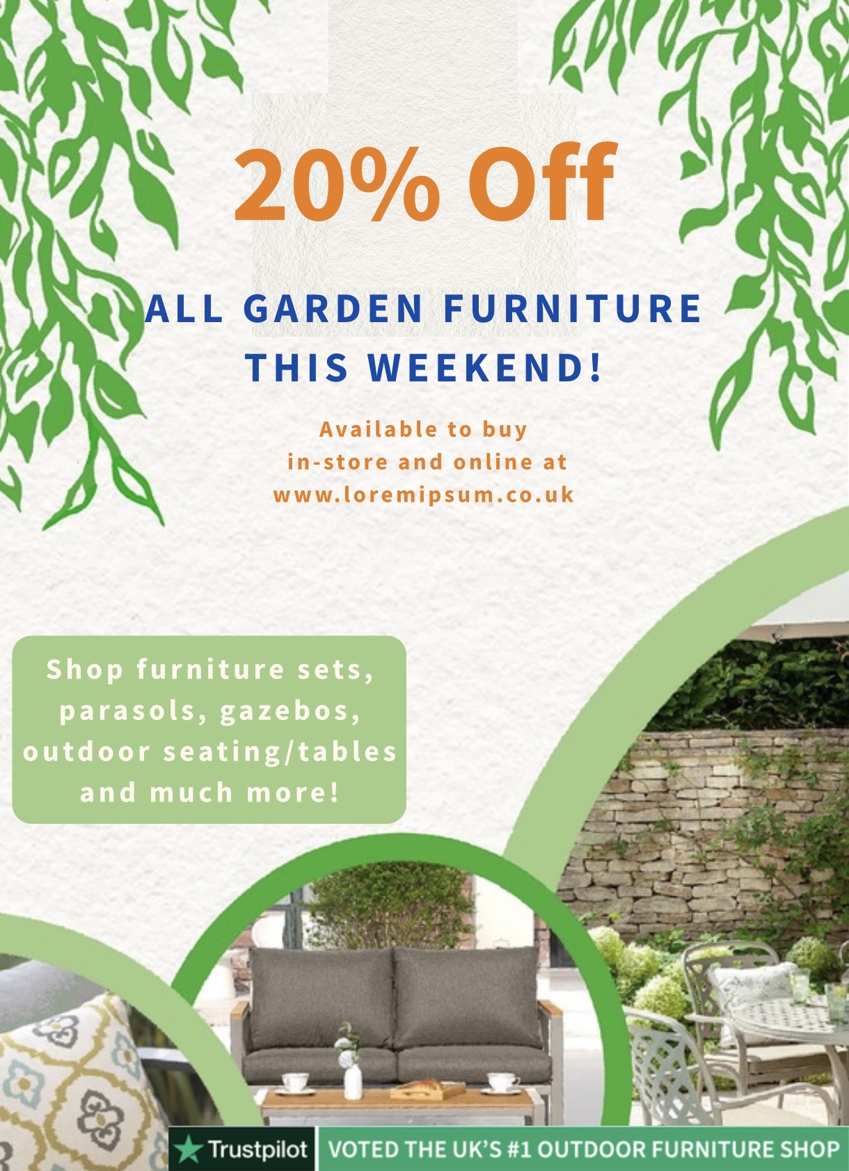
A multi-format promotional campaign for a garden centre — adapting the same 20%-off message across a web banner, a social media post, and an in-store poster, each with its own balance of image, typography, and layout.
Reflection
The Garden Centre campaign shows I can work to a commercial brief — adapting the same core message across three distinct formats while keeping a consistent palette and visual approach. Each piece has its own balance of image, typography, and layout suited to how it will be seen. This kind of multi-format campaign thinking is directly relevant to design and artworker roles.
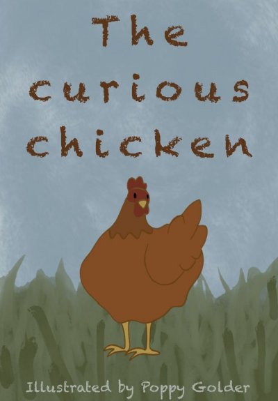
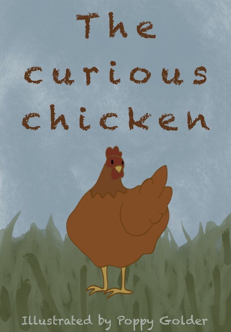
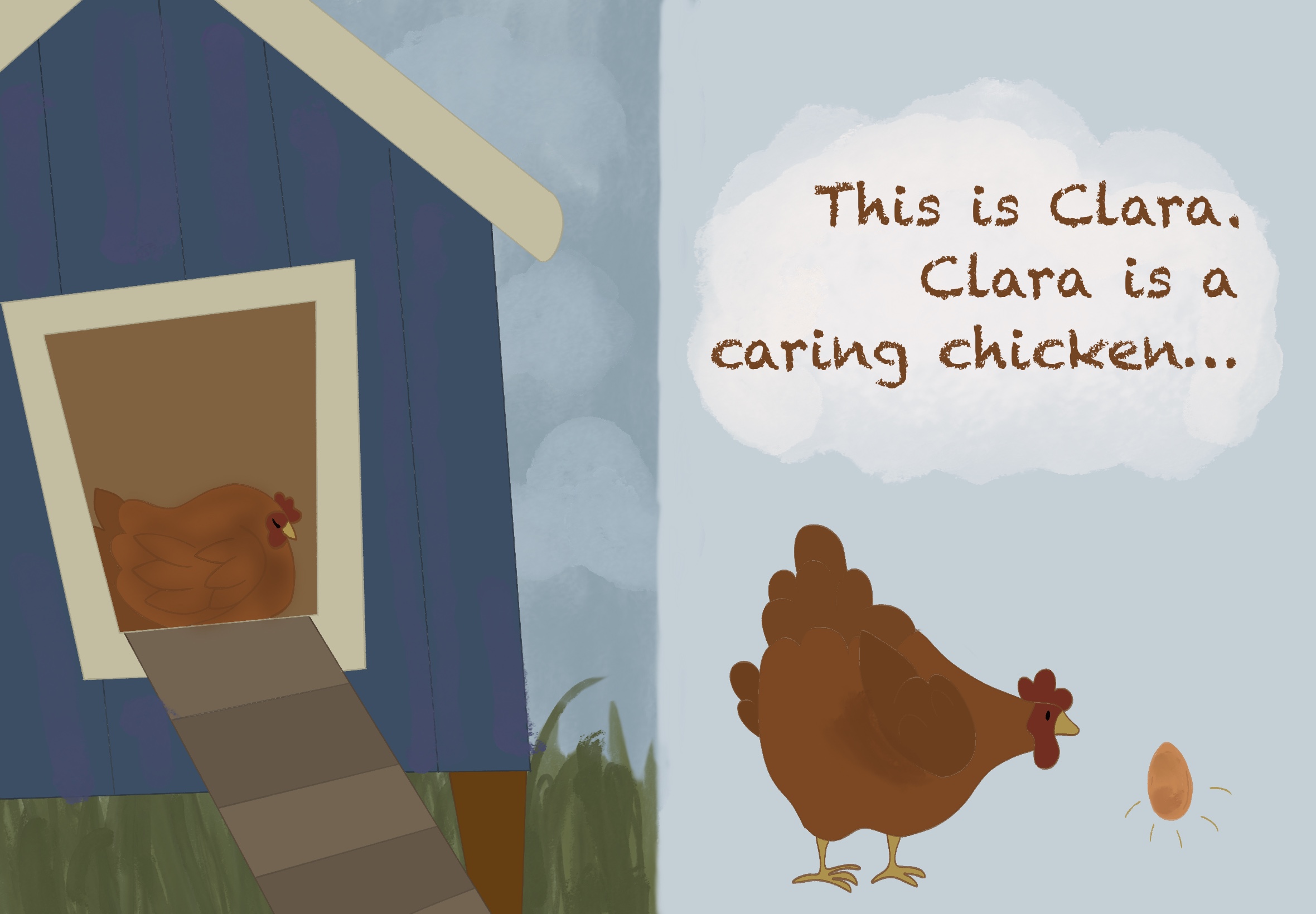
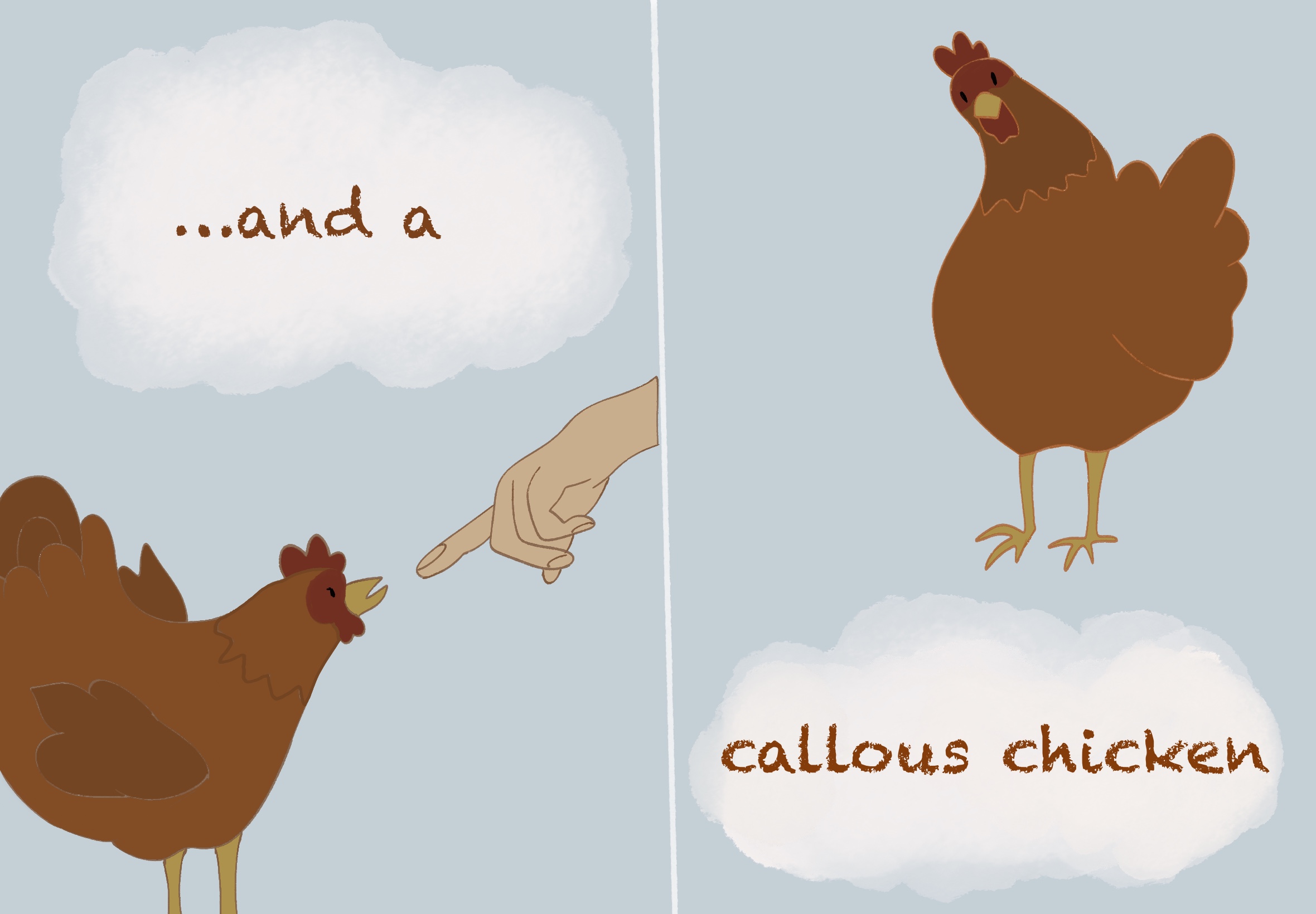
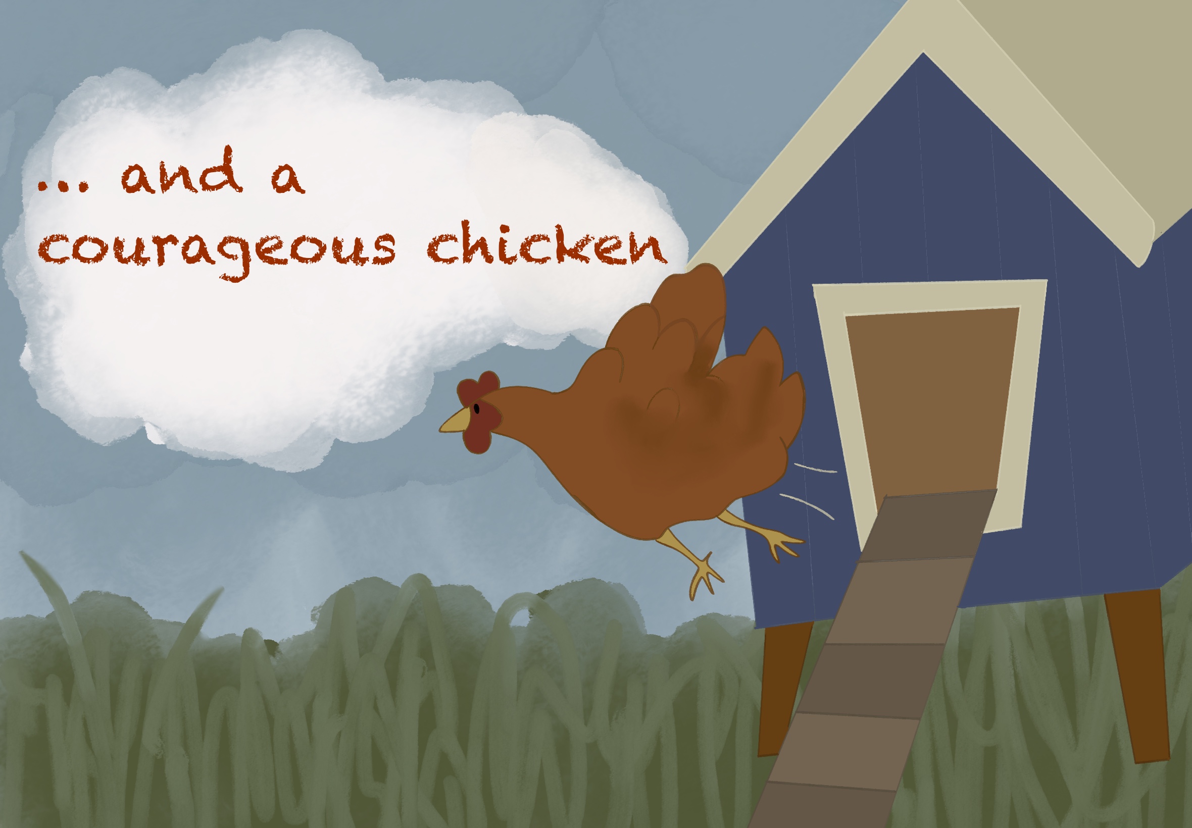
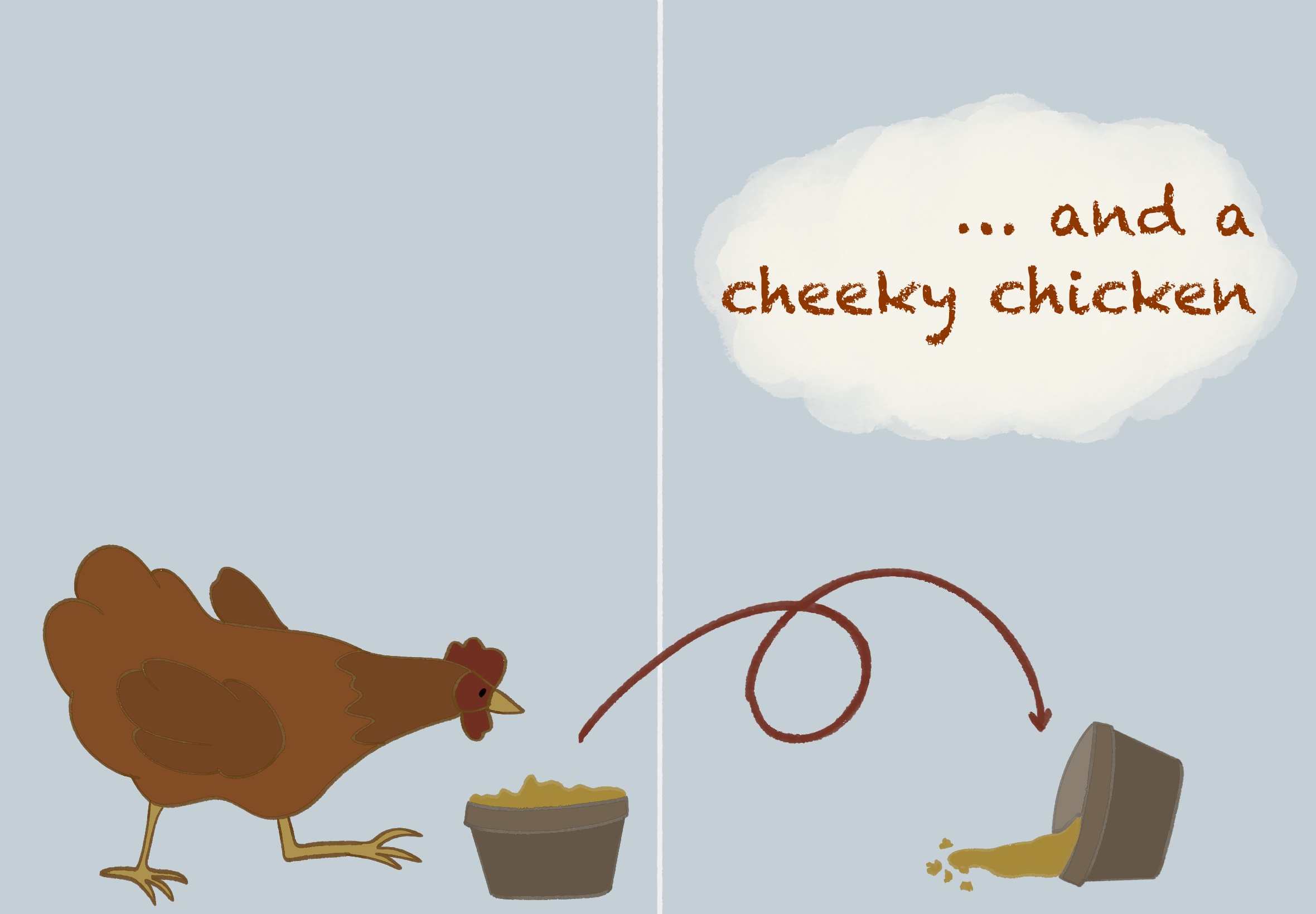
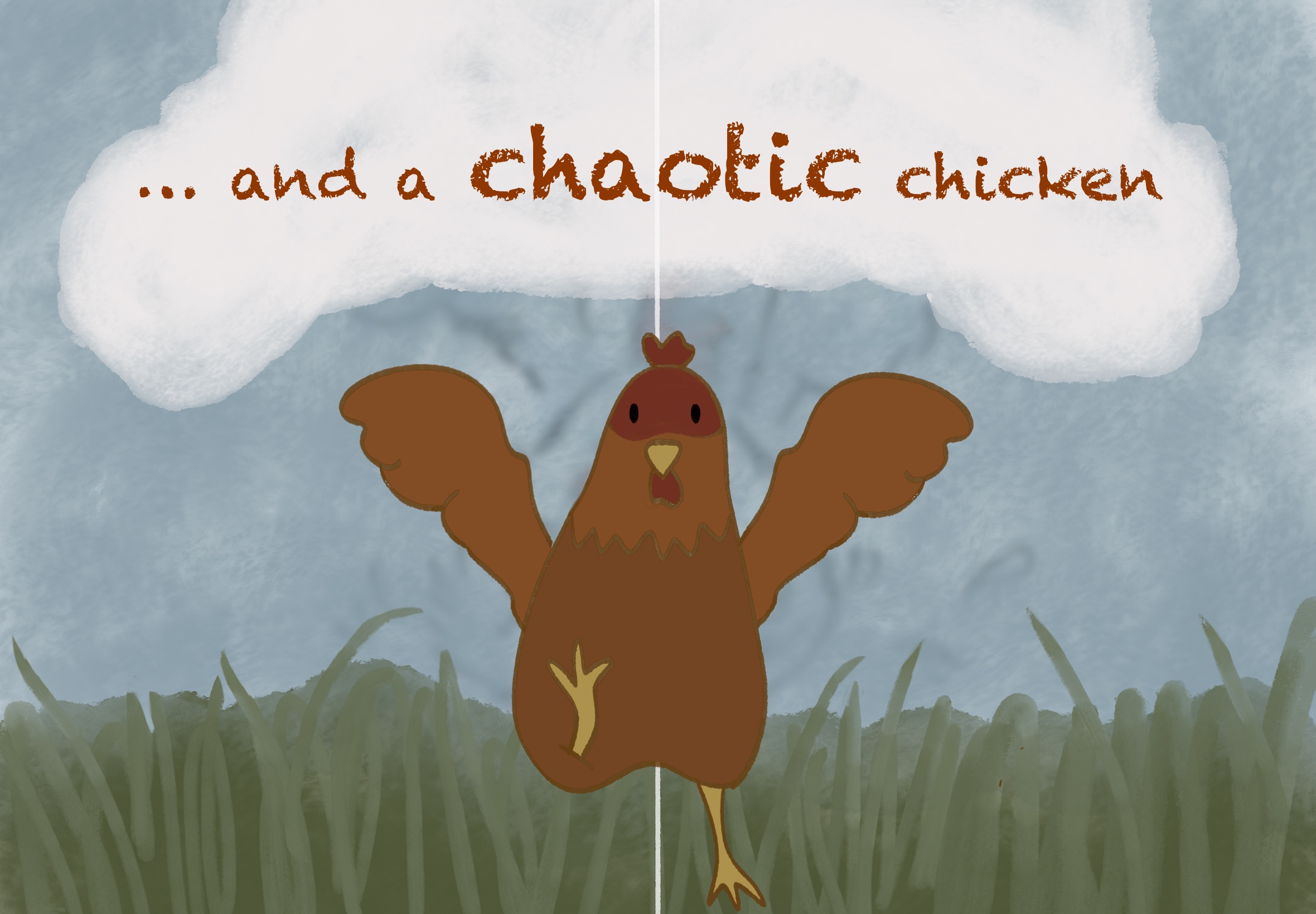
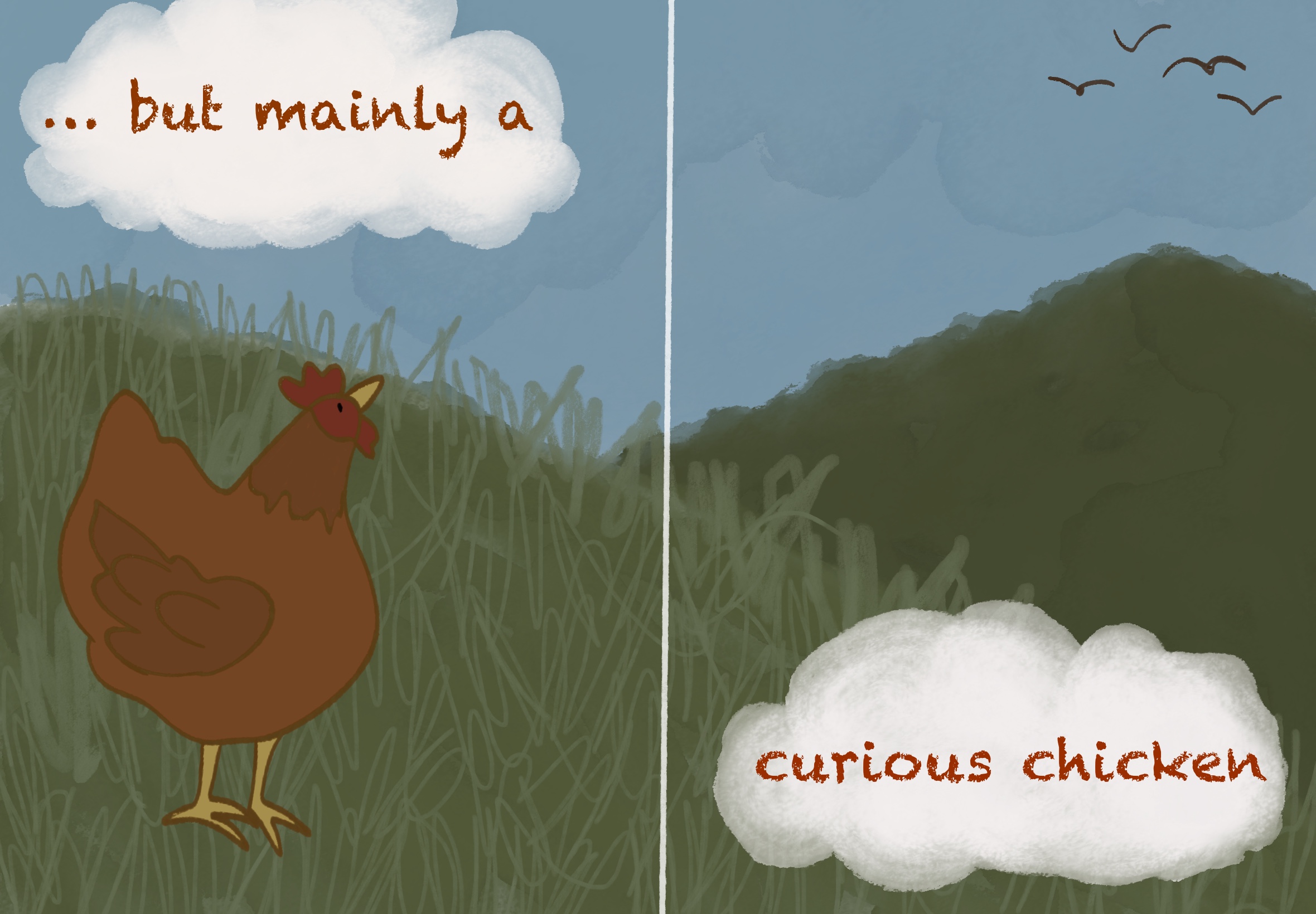
A fully illustrated children's picture book following Clara — a caring, callous, courageous, cheeky, chaotic, and above all curious chicken. Each spread combines warm digital illustration with hand-drawn typography, creating a consistent visual world from cover to interior.
Reflection
The Curious Chicken demonstrates my ability to sustain a character and visual world across a full picture book. From the cover through six interior spreads, Clara's personality is communicated through pose, expression, and setting — curious, chaotic, courageous by turns. The hand-drawn typography gives each page warmth and individuality, while the consistent palette and illustration style ties the whole book together. This project shows narrative illustration, sequential pacing, and the craft of making a story feel cohesive for a young audience.
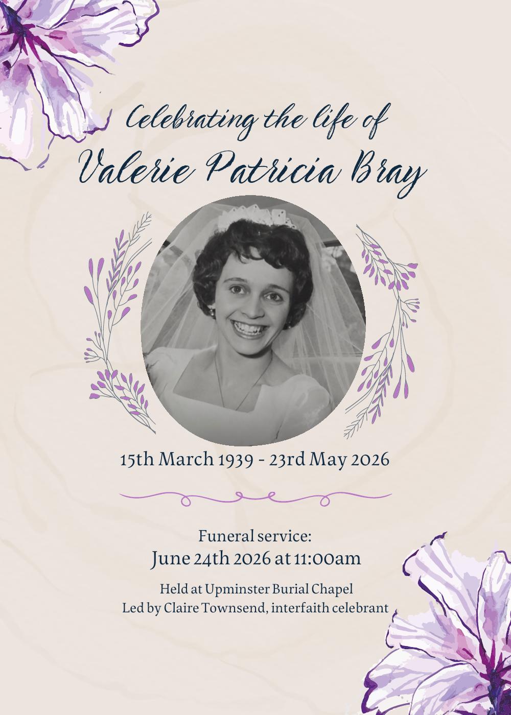
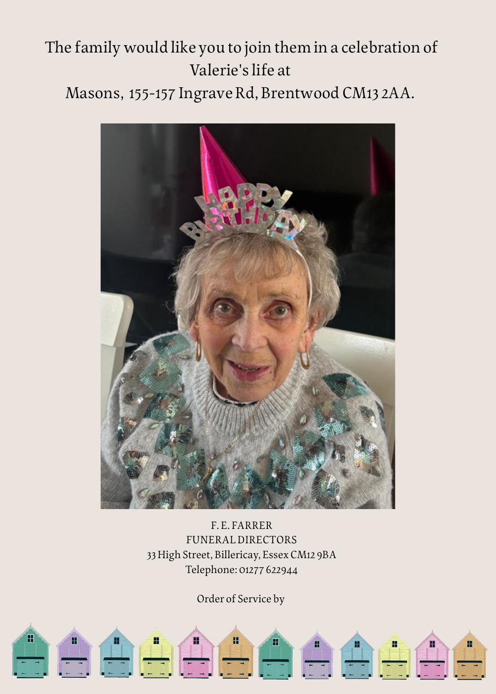
A sensitively designed order of service for a family memorial — balancing warmth, photography, and decorative detail to create something fitting and personal for a real occasion.
Reflection
This project required a completely different register to commercial design work — sensitivity, restraint, and care rather than impact and persuasion. Choosing the right typography, layout, and decorative elements to honour a person's life while remaining clear and readable for a grieving family is a meaningful design challenge. It demonstrates that I can adapt my approach to the emotional context of a brief, not just the visual one.
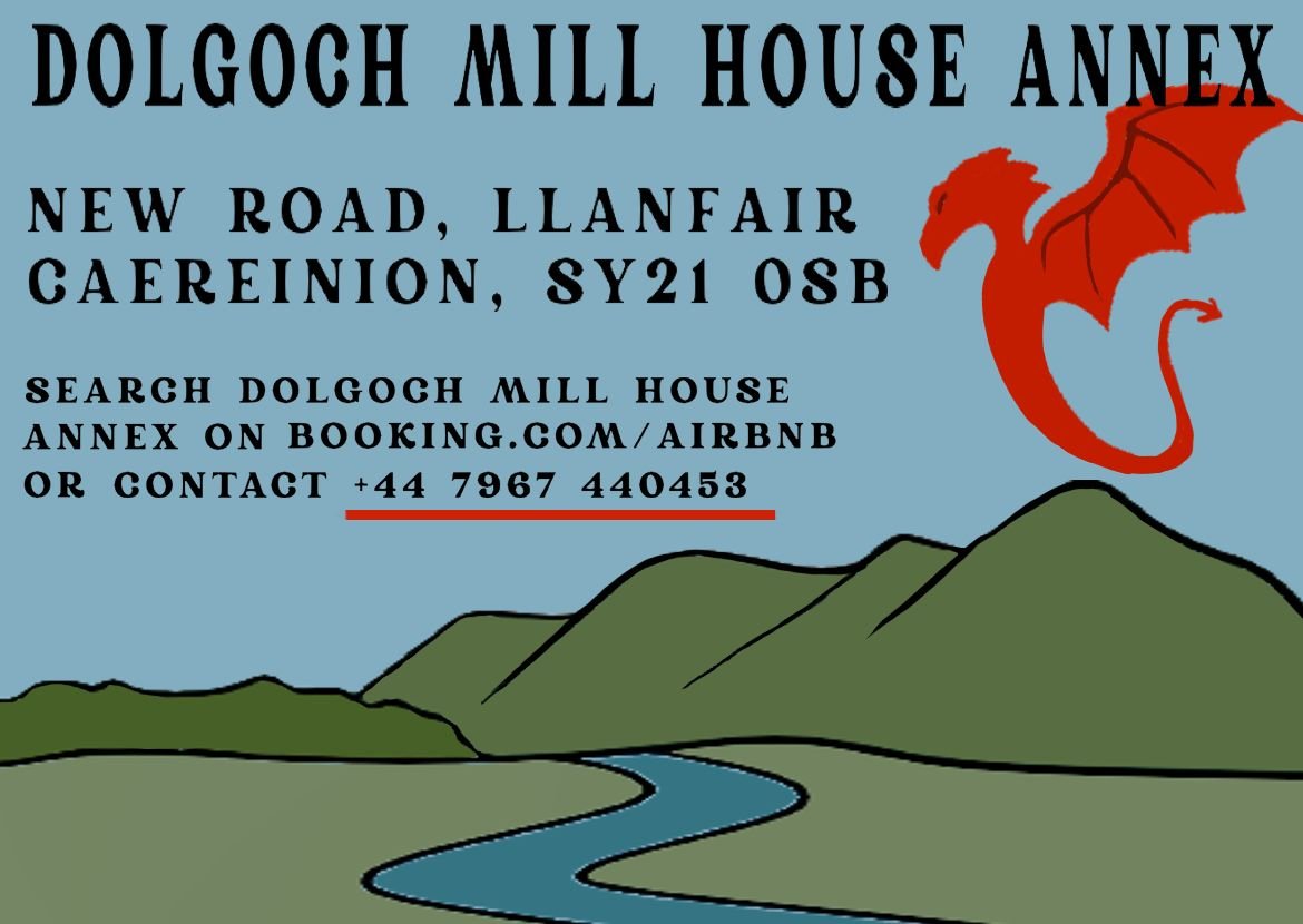
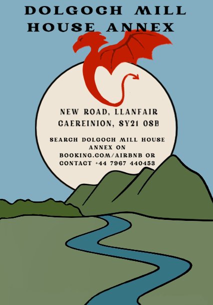
Brand identity and print design for a rural Welsh holiday let — adapting a single visual concept across a business card and a promotional flyer while maintaining consistency and clear information hierarchy.
Reflection
The Dolgoch Mill House project shows I can develop a visual identity for a real client and apply it consistently across formats. The Welsh landscape and dragon motif needed to feel authentic and inviting without becoming clichéd, and the two pieces — business card and flyer — had to work as a coherent set while serving different purposes. This kind of brand consistency thinking is directly transferable to design and print production roles.